Role
Team Lead (4 Product Designers)
Timeline
4 month
Omni Design System

Design System relaunch: From readability crisis to WCAG AAA
Problem
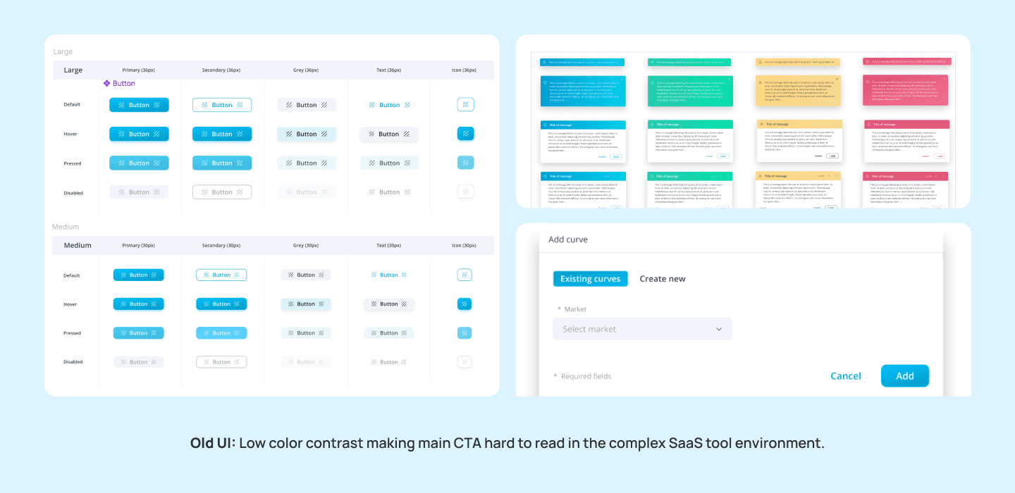
The Omni design system had not been updated for 6 years. it created by merge from components in multiple different products from different companys, hence multiple stylings co exists and it's long overdue for a full audit. For the primary color it used a bright gradient blue background with white text failed WCAG compliance entirely, vendors flagged it as a liability, and designers struggled with using it.
Process
I started by auditing what we had and identified our core problems:
Contrast failures (2.04:1) made documentation unreadable and created accessibility risk.
Shadow chaos: 12 different styles with no clear logic. Designers improvised, breaking visual hierarchy.
Font sizes: Instances of different font sizes were used for headers, CTA buttons, descriptions. Inconsistent sizing reads as unfinished or careless. Overtime it erodes confidence in the product.
No documentation. No dos and don'ts, no sizing guidance, no examples. Some components existed but were hard to use so designers detached often.
Color palette lacked systematic logic and locked to hex codes. Variations of colors and gradients co-existed in the product, designers picked and chose what they like to use. Future updates meant manually hunting through dozens of components.


Solution
Establishing Styling and Tokens
I led the team to focus on building strong foundations with tokenizing our style library.
Colors:
Structured the palette. Replaced scattered hex codes and names like "electric blue" with five palettes of 11 numbered steps each.
Built in accessibility. Labeled every swatch AA or AAA so text-safe colors are clear at a glance.
Added a semantic layer. Mapped primitives to purpose-based Text, Stroke, and Fill tokens, each with a documented use case.
Codified states and depth. Defined hover and pressed states, layered surfaces, and opacity-based overlays.
Made it theme-ready. Split themeable "primary" tokens from locked "brand" tokens for client re-skinning.
Typography:
Cut 50+ styles down to 14. Consolidated nine component-specific categories into one scale: 4 headings and 10 body styles.
Separated color from type. Removed variants like "Black," "White," "Gray," "Link," and "Error," so color now comes from text tokens instead of duplicated type styles.
Made naming predictable. Styles follow a
body-{size}-{weight}pattern, so devs can guess a token name without checking the docs.Standardized the math. Zeroed out letter spacing, snapped line heights to a 4px grid, and added rem values for accessible, scalable sizing.
Modernized the typeface. Moved from Open Sans to Inter for better screen legibility at small UI sizes.
Shadows:
Cut 12 shadows down to 5. Replaced one-off, component-named shadows with five elevation levels based on Material Design's approach.
Unified the light source. Old shadows used inconsistent offsets and directions; new ones share one global light for a cleaner, more realistic depth.
Removed colored shadows. Dropped tinted button shadows (blue, green, red, yellow) in favor of neutral shadows, so color stays in the color tokens.
Named by level, not component.
shadow-1throughshadow-5can be reused anywhere, instead of being tied to "calendar-shadow" or "dropdown-tooltip-shadow."


Documentation As Design
Components alone don't drive adoption. We added:
Dos and don'ts for each component
Grab-and-go examples (real patterns from product)
Min/max sizing guidance for developers
Interaction states (animated, not static)

Launch Process
Using Figma's Branching feature, we updated components incrementally and shared them with the dev team for implementation. Once complete, we merged branches into the main file and published updates. Designers could then refresh their work with a single "update" button click, eliminating hours of manual reattaching and redesigning. I hosted design system workshops and Q&A sessions to help teammates troubleshoot issues as they arose.


Built for the agentic future
Our token and documentation made the design system very readable for AI. As our company began to develop ai app builder and agent builders, the maturity of the design system was prominent. Clear guidelines trained our ai to build custom interfaces with design system accuracy. In the future, it is also ready to be interpret client and agency specific brandings, so generated content can be easily adopted onbrand.
Result
WCAG AAA compliance (2.04:1 to 5.96:1)
240% adoption increase
User feedback: "Much easier on the eyes"
Components became grab-and-go, with clear sizing and interaction states
The system went from avoided to actively used.
Shout out to redesigned UI! Much easier on the eyes for me and the users we train.
- Katie R., Director of Omni Enablement
Reflection
Design systems aren't about components—they're about reducing friction. Every token, shadow level, and line of documentation answers: "What does the designer or developer need to move fast?" Accessibility is foundational, not a feature. And adoption comes from documentation and demonstrable wins, not a beautiful Figma file. The real shift happened when teams understood why decisions were made, not just what to use.